Redesigning with Figma
Quddus George
With a bucket of digital paint.For the Wilmette Institute's certificate redesign I decided to try out Figma and see how quickly I could jump in to it for this short project.
I am happy with the results, and Figma has some great features I really like:
The smooth entrance into the application if you are already signed up is excellent and essential. It really feels smooth, like opening up a desktop program. Without this feature it would be really hard to use it repeatedly. I need to make note to operate this way with any in browser tool, requiring log-in or not. If the user has already started working on something, when they come back, send them right back to their work.
It was reletively fast to prototype. Fonts, however, felt a little convoluted with alternative names, and it was time consuming to check through them without dynamic previews.
No matter how many frames or assets, there we no visible slowdown, very impressive for a browser based program.
The redesign was approached with two things in mind:
- Lighten the mood of the certificates. While they mark course completion they do not authorize the recipient or license them in anyway.
- Align them with the Wilmette Institute's new brand.
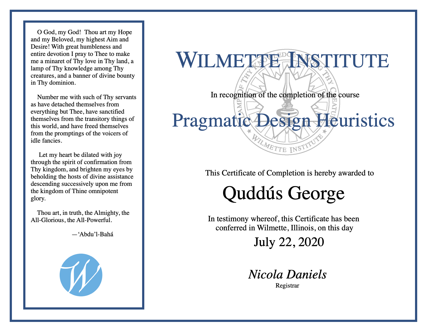
Here is an example of the previous version:
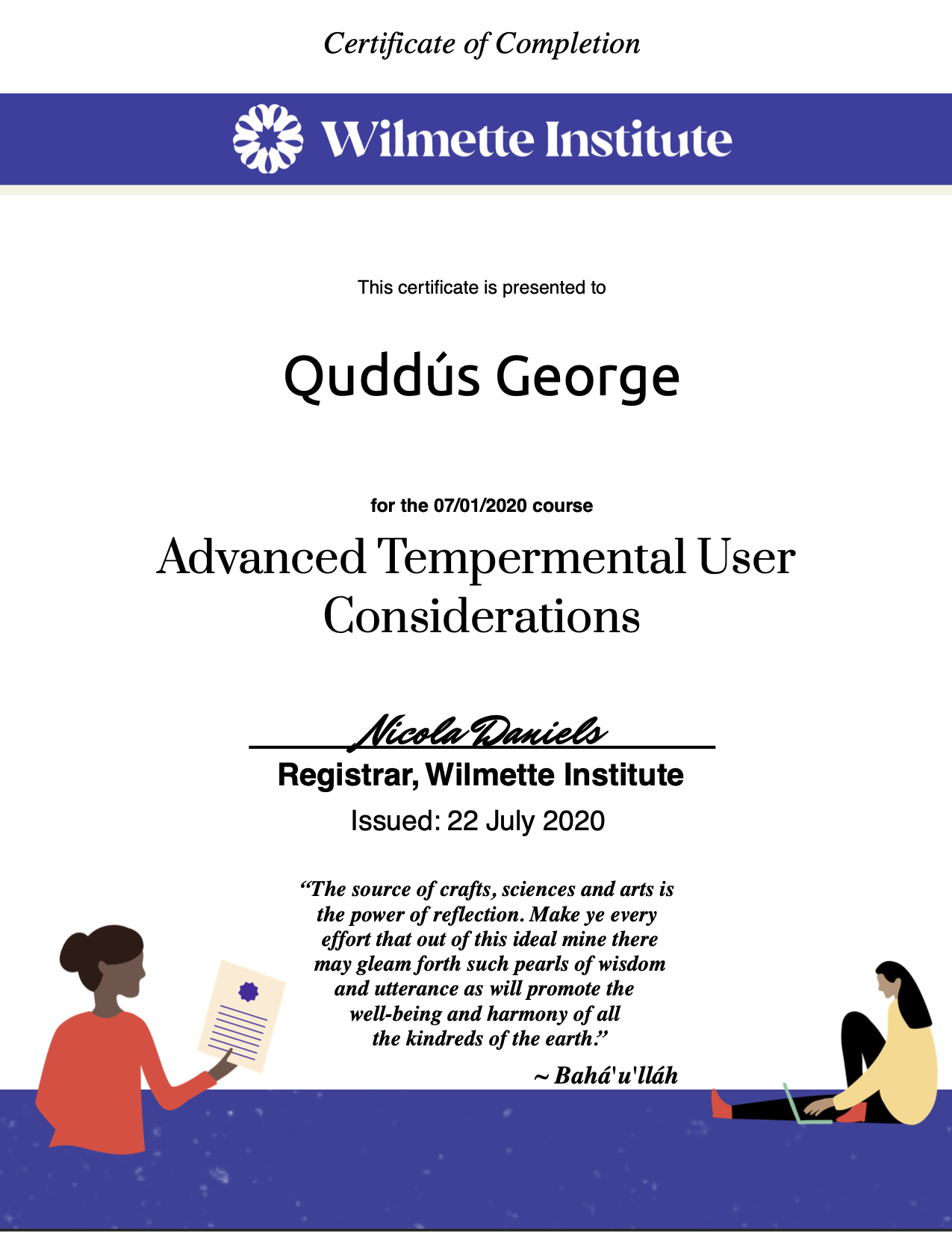
Here is an example of the end result:
In the end the most meaningful part of the experience with Figma was that there was no slowdown or lag, no matter how many frames or assets I loaded in. Well done Figma team.